Now Experience: Animation Groups
September 18, 2020
Precursor
One of the more difficult tasks when moving to a new component based system is the lack of premade pieces of functionality. In angularjs you have ngAnimate and in reactjs you have plugins like ReactCSSTransitionGroup. These pieces of functionality add in that extra pzazz in the form of smooth transition animations.
The Problem
Sometimes you want to expand or collapse a section of your component that contains a dynamic amount of content. This means that you can’t just use regular css to transition the height of a container element and slowly hide or show the content within. You need to be able to determine what the size of the content within a container is and transition that container accordingly. This will require some form of javascript.
The Goal
A premade plugin for transition animations doesn’t exist yet within now-experience and the goal of this post is to show how someone could tackle this problem.
Documentation
Documentation on the ServiceNow developer site states that there is currently support for functional JSX components. This means we can create mini-components where needed and bake in some functionality where those mini-components are used. Instead of having to create an entire now-experience component with createCustomElement we can just capitalize a function and assume it will be passed two parameters, props and children.
Functional components are currently listed with a warning symbol in the documentation and this could be because they will be changed in the future.
However, some base functionality that is already cemented in now-experience are the <Fragment /> functional components. These are used in tons of already existing components deployed by ServiceNow. The fact that these are in wide use should provide some comfort that JSX functional components aren’t going anywhere.
Example
By capitalizing a function and also assuming it will be given those two parameters we are setting up a functional component. This might look something like:
const Test = (props, children) => {
    return (
        <div className="test">
            <span>{props.title}</span>
            {children}
        </div>
    )
};
To call this new functional component we act like its just a predefined element with the same name.
<Test title="Some Title">
    <span>Inner Content</span>
</Test>
This will combine the children we provided with the props we added to the element.
<div class="test">
    <span>Some Title</span>
    <span>Inner Content</span>
</div>
Next Steps
Now that we understand how functional components work, we can finally start building our solution to animating transitions for dynamic content.
There are some key points where we want to either add classes to our container or perform specific functions. If we can handle both of those scenarios then we should cover a lot of bases.
- The two main points we need to focus on are when a container element should be entering the view and when our container element should be leaving the view. This is essentially when we want to show or hide the content it holds.
- We also need to be able to define how long the transitions last, the period of time it should take to enter or leave the view.
- If we can add classes that indicate when these transitions are occurring and also add hooks to perform functions at those times then that should be an entire solution.
The Solution
With knowledge of existing hooks the snabbdom renderer provides we can utilize both the insert and remove hooks. hook-insert will be called when the element is first connected to the view and hook-remove will be called before the element is removed from the view.
We can pass custom functions to run within these hooks by passing them into our functional component as props. We will name those props onEnter, onLeave, onEnterComplete, and onLeaveComplete.
We can also pass the durations of these transitions with props named enter and leave.
Finally, In order to provide an easy way to target the element in css is to provide a prop for the customClass you want to name your container.
export const SwTransitionGroup = (props, children) => {


    //┌─────────────────────────────────────────────────────────────
    //! We preset some of our props here so that they have default
    //! values when they are not provided manually.
    //└─────────────────────────────────────────────────────────────
	const {
		customClass,
		enter = 150,
		leave = 150,
		onEnter = () => {},
		onLeave = () => {},
		onEnterComplete = () => {},
		onLeaveComplete = () => {},
    } = props;


    //┌─────────────────────────────────────────────────────────────
    //! This is our hook-insert handler.
    //!
    //! This will remove the sw-entering class after a set amount
    //! of time and also trigger custom functions if provided.
    //└─────────────────────────────────────────────────────────────
	const handleInsert = (vnode) => {
		const { elm } = vnode;

		onEnter(vnode);

		setTimeout(() => {
			elm.classList.remove('sw-entering');
			onEnterComplete(vnode);
		}, enter);
    };


    //┌─────────────────────────────────────────────────────────────
    //! This is our hook-remove handler.
    //!
    //! This will add the sw-leaving class until after a set amount
    //! of time and also trigger custom functions if provided.
    //└─────────────────────────────────────────────────────────────
	const handleRemove = (vnode, removeCallback) => {
		const { elm } = vnode;

		onLeave(vnode);

		elm.classList.add('sw-leaving');

		setTimeout(() => {
			onLeaveComplete(vnode);
			removeCallback();
		}, leave);
	};


    //┌─────────────────────────────────────────────────────────────
    //! This is where we define the html template the component
    //! will use.
    //!
    //! We create the container element using a <div> and give it
    //! the custom class name if one was provided.
    //!
    //! This container element is then given the children as its
    //! inner content.
    //└─────────────────────────────────────────────────────────────
	return (
		<div
			className={`${customClass} sw-transition-group sw-entering`}
			hook-insert={handleInsert}
			hook-remove={handleRemove}
		>
			{children}
		</div>
    );


};
Helper Functions
This functional component is ready to go, but if you’re dealing with dynamic content, then you will want to create some custom functions to be triggered in your insert and remove hooks.
More often than not, we are just trying to smoothly transition some content in or out by using the height css attribute.
These two helper functions will auto generate hooks to hide and show your content.
//┌─────────────────────────────────────────────────────────────
//! Assuming you have an inner element that contains all of your
//! dynamic content, you can access that element and determine
//! what you need to set the height of your outer container to.
//!
//! The targetClass parameter is the inner-element that contains
//! all of your dynamic content.
//└─────────────────────────────────────────────────────────────
export const createEnter = (targetClass) => {
    return (vnode) => {
		const { elm } = vnode;

        const innerElement = elm.querySelector(`.${targetClass}`);

		if (!innerElement) {
			return;
		}

		const { offsetHeight } = innerElement;

        elm.style.height = `0px`;
		elm.style.height = `${offsetHeight}px`;
	};
};


//┌─────────────────────────────────────────────────────────────
//! Assuming you have an inner element that contains all of your
//! dynamic content, you can access that element and determine
//! what you need to transition the height from to get to zero.
//!
//! The targetClass parameter is the inner-element that contains
//! all of your dynamic content.
//└─────────────────────────────────────────────────────────────
export const createLeave = (targetClass) => {
    return (vnode) => {
		const { elm } = vnode;

		const innerElement = elm.querySelector(`.${targetClass}`);

		if (!innerElement) {
			return;
		}

		const { offsetHeight } = innerElement;

		elm.style.height = `${offsetHeight}px`;
		elm.style.height = `0px`;
	};
};
Using The Solution
With the functional component and helper functions built out we can now set up a section to show and hide dynamic content with a smooth transition animation.
//┌─────────────────────────────────────────────────────────────
//! First we import our new functional component and the
//! helper functions
//└─────────────────────────────────────────────────────────────
import { SwTransitionGroup, createEnter, createLeave } from 'SwTransitionGroup.js';


//┌─────────────────────────────────────────────────────────────
//! Then we generate our enter and leave custom functions
//└─────────────────────────────────────────────────────────────
const onNotesEnter = createEnter('notes-inner');
const onNotesLeave = createLeave('notes-inner');


//┌─────────────────────────────────────────────────────────────
//! Finally you just have to add your functional component to
//! the view and pass in all the props.
//!
//! By putting the element in a ternary if statement we can
//! toggle the content in and out of the view by setting
//! showNotes.
//└─────────────────────────────────────────────────────────────
{!showNotes ? null : (
	<SwTransitionGroup customClass="card-notes" onEnter={onNotesEnter} onLeave={onNotesLeave}>
		<div className="notes-inner">
			<span>Test</span>
		</div>
	</SwTransitionGroup>
)}
All we need now is a little bit of css using the customClass selector to add a transition property.
& > .card-notes {
border-top: 1px solid #e5e5e5;
overflow: hidden;
&.sw-entering {
height: 0;
transition: height 0.15s ease-in-out;
}
&.sw-leaving {
transition: height 0.15s ease-in-out;
}
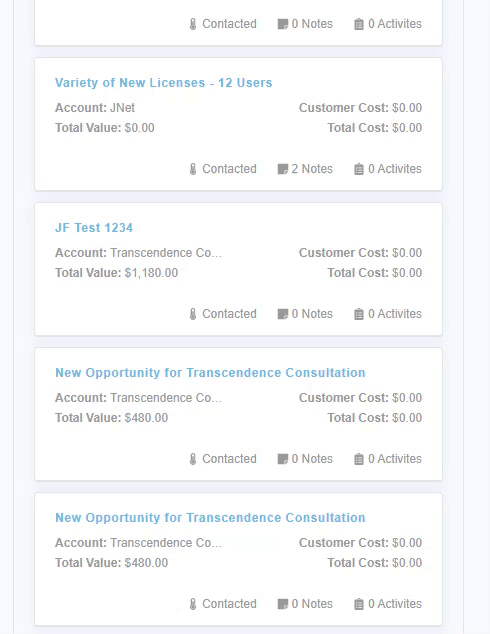
}Final Result
Below you can see how it all turned out. Instead of our content just appearing and disappearing we can now transition our content smoothly in and out of the view.
Conclusion
The whole setup process took a little longer than I originally hoped, but it will allow myself to add smooth transitions all over the place. The functional component definitely has more applications than just transitioning the height of a container with dynamic content, but that is what I needed it for. Hopefully it will provide some use to you when developing supreme user experiences for Agent Workspace!